Hands-on · Case 03 of 3
Bringing a desktop‑era platform to phones and tablets.
Vantage Circle is an employee recognition and rewards platform, used by 3.2M+ users across 700 companies. It was built for desktop, and “responsive” did not mean it made sense on a phone. The brief was to improve the mobile view; I ended up writing the mobile layer the product never had.
The outcome: phones and tablets went from a desktop layout that happened to fit to a mobile layer of their own — one set of breakpoints the whole product agrees on, a redemption hub built for a thumb, and controls that respond to touch instead of to a mouse that isn’t there.
The platform is thirteen years old and was built for desktop. Mobile support had been added reactively over the years: a breakpoint here, an override there, by many people solving their own immediate problem. Nobody had ever sat down and decided what mobile should be.
The result did not look broken on phones. It looked almost right, which made it harder to diagnose. Everyone agreed mobile needed work, but there was no single screen or rule to point to.
01There was no breakpoint system yet
I found the problem as a contradiction between two numbers. The app decided “is this a small screen?” in TypeScript, at 959.98px. The stylesheets decided the same question in CSS media queries, at 767px. In the gap between them the app rendered its mobile component structure while serving desktop styling, because no mobile media query ever matched.
That gap is iPad portrait. Every iPad in the building sat inside it.
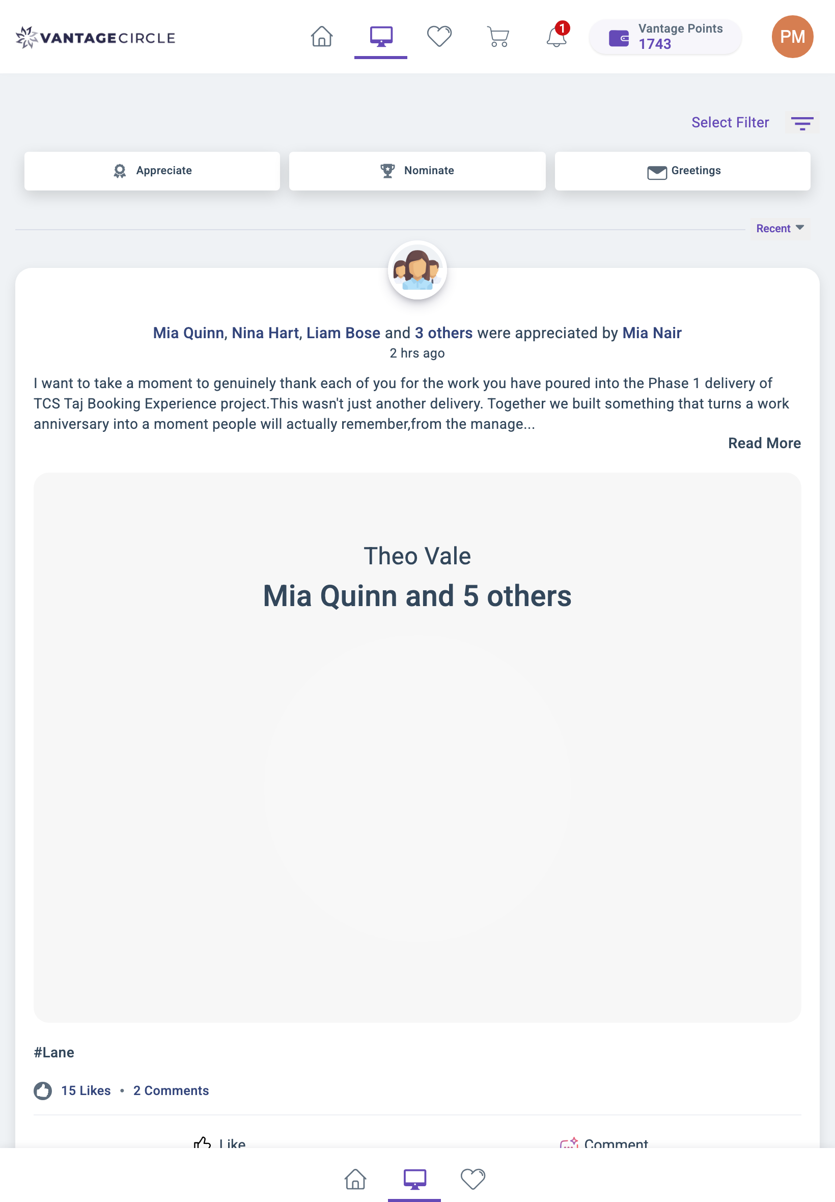
Here is what that produced at 820px, iPad Air width. A desktop header with the full icon row, points wallet and profile avatar, and a mobile bottom navigation bar, both on screen. Two navigation systems, neither aware of the other. The feed card underneath runs edge to edge with no containment, and the post’s image well opens into an empty rectangle big enough to push the like and comment actions off the bottom of the screen.
Before · 820px
After · 820px
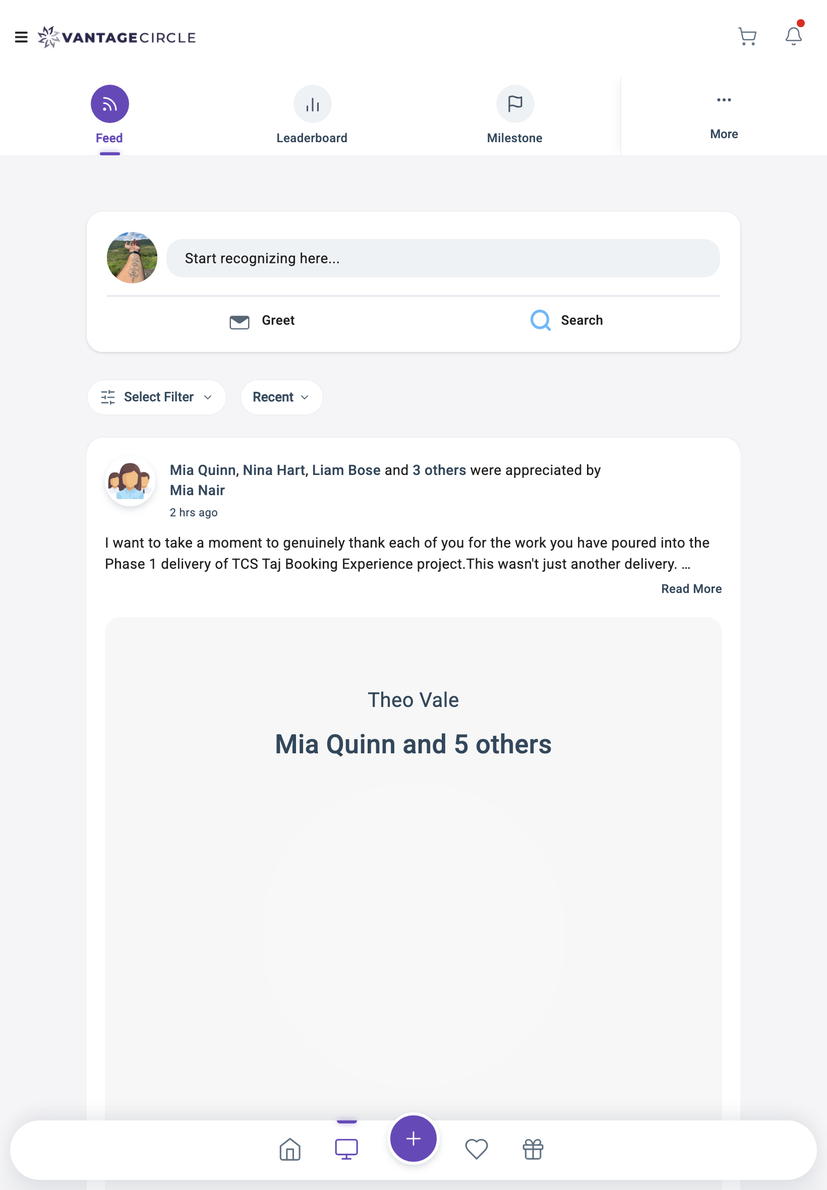
The obvious next move is to change one number so they match. That is not what this turned out to be.
When I went looking for the breakpoint system to correct, there wasn’t one. The TypeScript checks and the CSS queries had been written separately, years apart, by different people, each solving a single screen. No shared definition of what “mobile” meant existed anywhere in the codebase. The two numbers didn’t disagree because someone made a mistake. They disagreed because nothing had ever made them agree.
So I wrote it: a deliberate set of breakpoints, applied consistently across the app, which meant auditing every component that made a size decision and bringing it onto the new system. Roughly 60 components were affected.
The decision underneath it was where to put the boundary. Dropping the threshold to 767 would have handed every iPad the full desktop layout: consistent, and miserable on an 820px screen. Going the other way meant committing to a position.
A portrait iPad is a big phone, not a small desktop.
I set it at 960. Small iPads in portrait get the mobile layout, where the touch targets and single-column reading order suit how people hold them. iPad Pro 12.9″ and anything in landscape gets desktop, which it has the room for.
02Density without deleting the celebration
The rewards leaderboard has a podium: top three, with crowns, laurels, ranked colour treatments, and an outline highlighting you if you are on it.
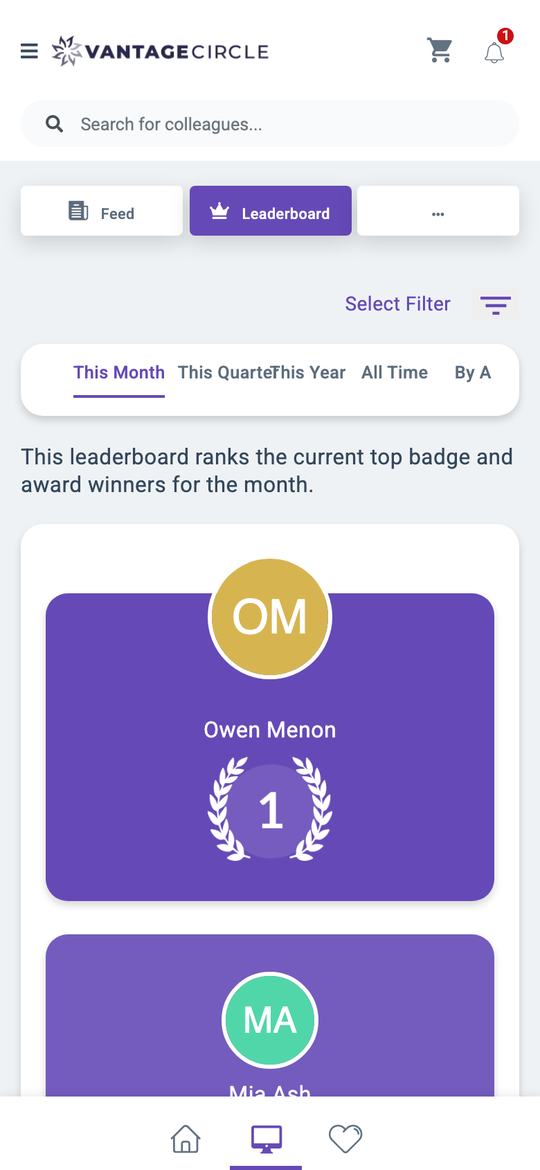
On a 390px phone it had two problems. The podium gave each person a full-bleed block of colour with their rank rendered as a separate laurel graphic below the name, so one person filled most of the viewport. Seeing all three meant scrolling through three screens of a component whose whole job is instant comparison. Above it, the time-range tabs had given up: “This Quarter” and “This Year” overlap mid-word, because the strip had no overflow strategy.
Before · 390px
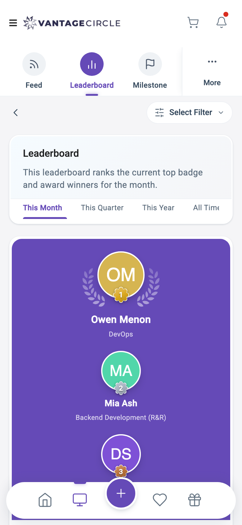
After · 390px
The quick fix for a podium that doesn’t fit is to drop it on mobile and render three rows with medal chips. It is clean and responsive and it deletes the reason the feature exists. Recognition products run on that small moment of delight; flattening it to a list is a design failure wearing a technical improvement as a disguise.
I compressed instead. The rank moved onto the avatar as a rosette badge rather than sitting below the name as its own graphic. The laurel wrapped the avatar instead of taking a separate row. The vertical space that freed up went to each person’s department, which is the context that makes a leaderboard readable in a company of any size. The section strip got the same treatment: boxy rectangles that overflowed became icon-and-label items with a sticky “More” menu, so the row can’t collide with itself as sections get added.
03A surface that exists only on mobile
Redemption on desktop runs off a subheader: a row of options across the top of the store, gating what you can reach based on your wallet, your region, and which programs your company has enabled. That row has nowhere to go on a phone.
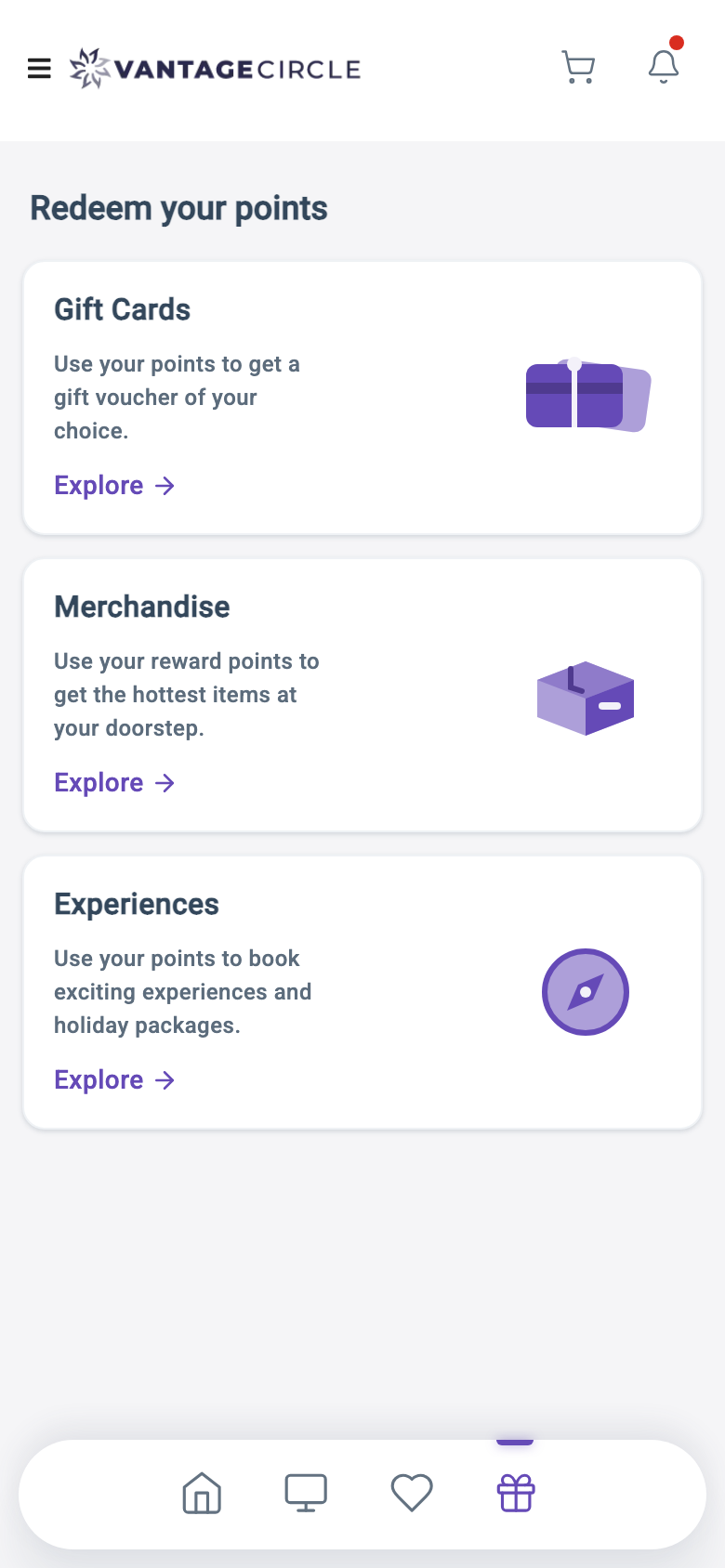
Vantage Circle also has a native mobile app, and it doesn’t use a subheader; it uses a redemption landing screen. So the answer wasn’t to invent a mobile pattern from nothing. It was to bring web into line with the app, so someone moving between the two isn’t relearning where redemption lives.
On mobile the hub becomes the front door: each redemption route as a card with its own illustration and a clear next step, carrying the same gating logic the desktop subheader applies, multi-wallet cases included. It changed the bottom navigation too. Profile was the weakest item there: profile is reachable from the header, and redemption is what people open the app to do. I swapped it for the gift-icon Redeem tab, and wired every back arrow in the flow to return to the hub instead of dropping users into browser history.
Of everything here, this is the piece I would want to talk about in an interview. It only becomes available once you stop treating mobile as desktop with less room and start treating it as its own product surface with its own conventions, ones this company had already established elsewhere.
04Finding the real scroll owner
I wanted the bottom navigation to hide on scroll down and come back on scroll up, so content gets the screen back while reading. The standard implementation listens for scroll on the window. I wrote it, and nothing happened.
On mobile this app renders inside a Material drawer, and the element that actually scrolls is the drawer’s content container. Not the window. Every window-level scroll listener in the mobile shell was silently dead, and had been for as long as the shell existed. Nothing had needed one before, so nobody had found out.
// Never fires on mobile. The window doesn't scroll; the drawer does.
window.addEventListener('scroll', onScroll);

// The drawer's content element is the real scroll container.
scrollContainer.addEventListener('scroll', onScroll);
No error, no warning. The first version is valid code that runs happily and reports nothing, which is why it survived. I built the fix as a reusable directive that attaches to the true scrolling ancestor, so the next person wanting scroll behaviour doesn’t rediscover this.
Two details worth keeping. The bar hides by translating down its own height plus the bottom inset, the device safe-area, and 24px of slack. The bar carries an upward shadow, and without that extra clearance a 16px shadow blur stays visible below the fold as a grey smudge. And the transition is disabled under prefers-reduced-motion, because a nav bar that animates on every scroll is exactly the kind of motion that makes people with vestibular sensitivity put the phone down.
05Fixing without force
The gift-card store showed one card per row on mobile, for content that is fundamentally a
grid of brand logos. The markup said col-xs-12, which looked deliberate. But the
project runs Bootstrap 4, which removed the xs infix: the class had been doing
nothing, silently, for years, and because it read as correct, everyone who opened that file
concluded mobile was handled and moved on. Including me, the first two times. The fix was one
word. Dead code that looks alive is more expensive than code that is obviously missing.
The codebase also had the usual !important sediment. It is where you end up when a lot of people patch styles under deadline, and it compounds: every one of them raises the floor for the next person.
I worked under a constraint of no new !important, enforced by a linter rule and a pre-push hook. Every override had to win the cascade honestly: specificity, rule order, or setting the design token the component library actually reads. That constraint taught me more about this codebase than anything else I did.
Angular’s scoped styles already give component rules more specificity than most people assume, so a large share of the existing !important declarations were never necessary. The rule underneath would have won on its own.
/* What you write in a component stylesheet */
.card-title { font-size: 14px; }

/* What Angular actually compiles it to. The scoping attribute
   counts, so this is specificity 0-2-0, not 0-1-0; it already
   outranks the global utility it was fighting. */
.card-title[_ngcontent-abc] { font-size: 14px; }
Angular Material is the opposite case
Material injects its component CSS at runtime, after the stylesheets load, so a direct override loses that race no matter how specific you make it. Raising specificity is the intuitive response, and it doesn’t work. You have to set the token Material itself reads.
/* Loses. Material's own rule is injected later and wins on
   cascade order, however specific this gets. */
.mat-mdc-menu-panel { box-shadow: 0 8px 24px rgba(0, 0, 0, 0.12); }

/* Wins. Setting the token means Material applies the value. */
.mat-mdc-menu-panel {
  --mat-menu-container-elevation-shadow: 0 8px 24px rgba(0, 0, 0, 0.12);
}
Which is also just the supported way to do it: tokens are the public API, overrides are reaching behind the component and hoping. This is the same mechanism that made Material’s date pickers ignore tenant branding in the design-system project, and that fix had to go through the token API for the same reason.
Material’s typography is a third variant: it beats single-class font utilities on headings by pure arithmetic, .mat-typography h2 scoring 0-0-1-1 against .fs-14’s 0-0-1-0. Every font utility competing on an h1–h6 had to be written around that.
None of this is visible. The UI looks the same. The next person to change these styles can do it in one line instead of five.
06Knowing what not to fix
Two of my better calls were leaving things alone.
The activity feed had uneven padding and clipped badge images, visible in the captures at the top of this page, where the post’s image well opens into an oversized empty rectangle. I went in expecting a stylesheet bug and found it came from inside a shared internal package rather than this application. Overriding it locally would have taken ten minutes. I documented the root cause for the package owner instead. A local override fixes it for one app while every other consumer keeps shipping the bug, and it breaks the next time the package updates.
A promotional banner was cropping its artwork. Same instinct, different answer: a fix was already in flight from another team, and patching it locally would have handed someone a merge conflict and saved nobody anything.
Both are the same question. Is this mine to fix? Not every bug you can reach is one you should touch.
07How the work was split
I owned the mobile work from audit through implementation: the breakpoint system, the design, and the app-wide styling pass. Two designers on my team repaired mobile issues on the pages they owned, so their surfaces came onto the new breakpoints alongside mine. The rest of the contributors on the branch were developers keeping builds green and clearing issues the test team raised.
Worth being clear about, because the commit history shows ten names on this branch and only some of that work is mine. My share was 89 commits across 647 files, of which 88% was styling and markup rather than logic.
08What changed
The product now has a mobile layer instead of a desktop one that shrinks. Both halves of the app answer “is this a small screen?” the same way, so iPad portrait stopped falling between them, and redemption — the thing people open the app to do — has a front door on mobile instead of a subheader built for a cursor. What I cannot yet show is the usage shift behind it; these went out in waves alongside the accessibility work.
09What I’d take from it
Given “make it better on mobile”, the tempting move is to open the worst-looking screen and start adjusting. I measured first, and everything after the breakpoint work was cheaper for it.
The less flattering lesson is that building this from scratch would have been easier. No mobile layer existed, the grid classes lied, and the scroll listeners pointed at the wrong element. Every fix was also an excavation. Mobile first, as an estimate of what the alternative costs rather than a slogan.
Working in the codebase also changed what I could design. The Redeem hub, the hide-on-scroll bar, the podium compression: none of those were specifiable as static screens. They came out of knowing what the code could actually do.
Every screenshot on this page is a real capture from a running build, taken at the same viewport, route and account on both sides of each pair; the “before” images come from the actual pre-project commit, not a reconstruction. All captures were taken through an anonymising proxy: every name, avatar and email address in them is generated, and the initials avatars are drawn rather than photographed. The code samples are illustrative, written out to demonstrate public framework behaviour (Bootstrap’s grid classes, Angular’s style scoping, Material’s token API) and contain no source, class names or file structure from the employer’s codebase.